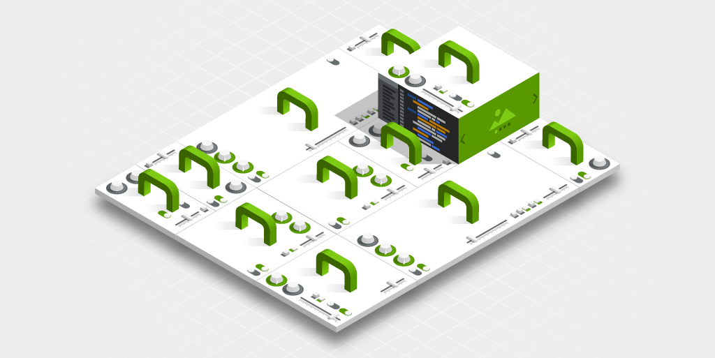
Hello Magnolia - SPA
In this tutorial, we will learn how to use the Visual Single Page Application (SPA) Editor to build stunning websites with ReactJS, Angular and Vue.
Basic form-based headless CMS systems are good for constrained and predefined content types. However, to give marketers the ability to create articles, page structure or create their own custom landing pages or microsites, the Magnolia SPA Editor will accelerate your Marketer and free up your development capacity.
The Visual SPA Editor is bridging the gap between enterprise-level content management systems and SPA frontend development.
What are we going to build?
We are going to build a Travel Website SPA promoting travel packages.
In the Hello Magnolia - Headless tutorial, we have built a basic Headless CMS Website. In the present tutorial, we create an application, but enable the Marketer to visually change the SPA.
-
Marketers can add new navigation items.
-
They can create new pages and arrange the content freely with a pre-defined list of Components.
Prerequisites
-
Magnolia CLI and required development tools. The instructions are here.
Install the demo project
To jumpstart our project, we will install our demo project. The easiest way to do this is to clone our git repository.
-
Clone the Git repository.
git clone https://bitbucket.org/magnolia-cms/minimal-headless-spa-demos.git -
Switch to the
minimal-headless-spa-demosfolder:cd minimal-headless-spa-demos
Install Magnolia
-
Change directory to
magnolia.cd magnolia -
Start
magnoliainstallation.mgnl jumpstart -
Choose
2) magnolia-community-webapp:? What Magnolia would you like to install? 1) magnolia-empty-webapp 2) magnolia-community-webapp 3) magnolia-community-demo-webapp 4) magnolia-dx-core-webapp 5) magnolia-dx-core-demo-webapp Answer: 2Once the installation is finished, you will see an output similar to this on your console:
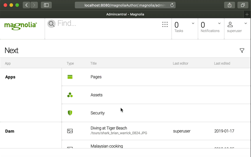
info Magnolia has been successfully setup for light development! info You can now open a new terminal tab or window and start it up with the CLI command 'mgnl start' info Magnolia will be ready after a few seconds at localhost:8080/magnoliaAuthor. Username and password is superuser -
Now, pick up some handy configuration and sample images.
From the
magnoliadirectory, run:cp -rv ./_dev/content-to-bootstrap/* ./apache-tomcat/webapps/magnoliaAuthor/WEB-INF/bootstrap/common (1)xcopy .\_dev\content-to-bootstrap .\apache-tomcat\webapps\magnoliaAuthor\WEB-INF\bootstrap\common\ /E/H (1)1 This copies all files inside /magnolia/_dev/content-to-bootstrapinto/magnolia/apache-tomcat/webapps/magnoliaAuthor/WEB-INF/bootstrap/common. -
Start Magnolia.
mgnl startWhen the terminal shows
Server startup in […] milliseconds, Magnolia is up and running. -
Open http://localhost:8080.
-
Click
Run the Web update on the author instance. -
Login with:
-
username:
superuser -
password:
superuserHelp is here. Are you having any trouble with starting Magnolia? Ask for help on our Google group, and we’ll get you setup!
-
Install the SPA
We include a React, Angular and Vue example, just choose which one you want to use. In your terminal, go to the actual frontend app directory (for React, Angular or Vue).
cd ../spa/react-minimalnpm installnpm run startBe sure you first install the Angular CLI.
npm install -g @angular/cli (1)| 1 | The -g flag installs the Angular CLI globally on your computer. |
cd ../spa/angular-minimalnpm installng servecd ../spa/vue-minimalnpm installnpm run serveSee It In Action
Let’s have a look at the running demo containing the starter content before we inspect the Starter Code. In the previous chapter, we have started Magnolia and built and started our SPA project.
Install demo content
To install the Demo Content follow these steps:
-
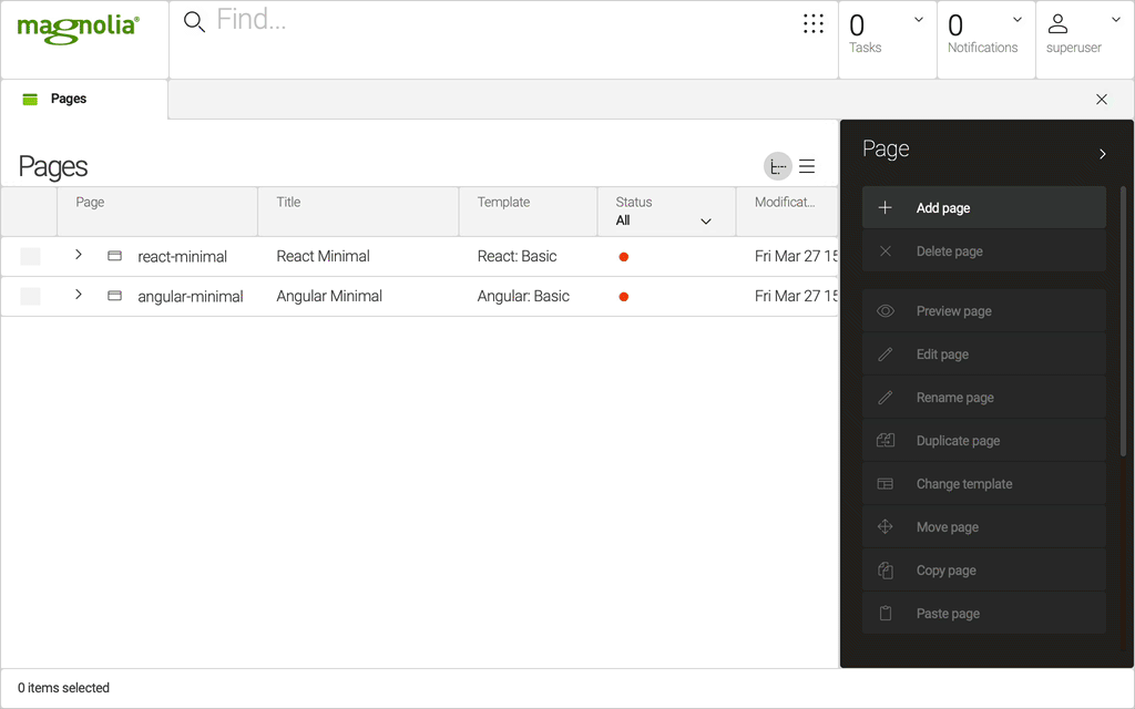
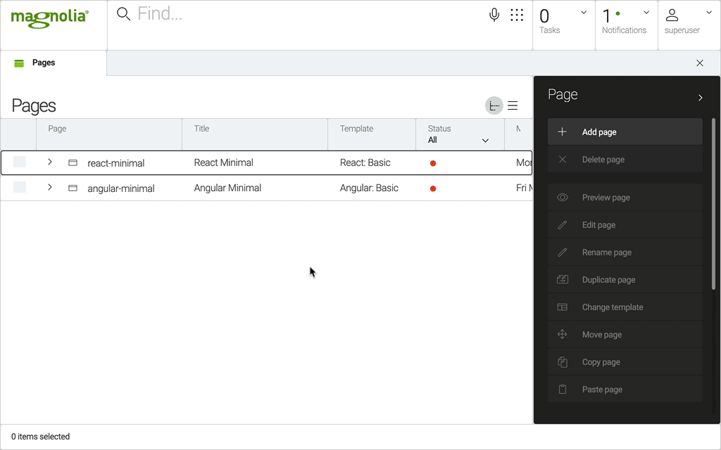
Open the Pages app in your browser.
-
Click
Importaction (You might need to scroll down in the action bar.) -
For React, select the file
./magnolia/_dev/content-to-import/website.react-minimal.yaml. -
For Angular, select the file
./magnolia/_dev/content-to-import/website.angular-minimal.yaml. -
For Vue, select the file
./magnolia/_dev/content-to-import/website.vue-minimal.yaml.
Page Builder
In the Pages app, open the SPA Project by double-clicking on react-minimal, angular-minimal or vue-minimal depending on which project you have installed.
Now you can see the React, Angular or Vue app rendered in the Magnolia Page Builder. Go-ahead and try to change the title or add an image.
|
To see the images displayed in the SPA app on
|
You are editing a SPA!
Inspect the Code
Let’s see how our demo project is structured:
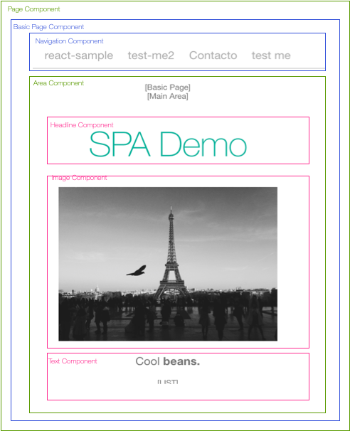
The blue and green components are fixed components, the developer controls them and their position. The magenta components inside the Area Component are controlled and freely arranged (added, moved, deleted, etc.) by the marketer. The marketer uses the Page Editor to edit the SPA with components built and defined by the developer.
You can look at it as the developer putting handles and knobs on frontend components, so that marketers and content authors can move them around and tune them with custom content.
The green Page Component and Area Component are provided by Magnolia.
-
The Page Component is responsible for rendering the top frontend component, and preparing the Magnolia Page Editor.
-
The Area Component is mapping the content created by the marketer, to the components defined by the developer, in order to render them. You can define multiple area components on the same Page Component, and a component can have one or more areas of its own.

Light Modules
You can share code and components in multiple light modules.
Shared Light Module: spa-lm
The Magnolia templates and dialogs are the same no matter the front-end framework, so the demo project puts all the shared content in the spa-lm module.
cd magnolia/light-modules/spa-lmApplication Light Module
The actual SPA will be deployed to a front-end framework-specific module.
We have defined two page templates, which the marketer will be able to include in our SPA in the page builder. In the page template, you can define areas and which components will be available in the areas.
cd ../../../react-minimal-lm;
cd templates/pages;
cd ../../../angular-minimal-lm;
cd templates/pages;cd ../../../vue-minimal-lm;
cd templates/pages;Have a look at
-
basic.yaml -
contact.yaml
Frontend app Structure
Open your project in:
minimal-headless-spa-demos/spa/react-minimal/srcminimal-headless-spa-demos/spa/angular-minimal/src/appminimal-headless-spa-demos/spa/vue-minimal/srcWe have two categories of templates: Page and Components.
In our source directory, we have two subdirectories: Page (containing Layout Components) and Components.
-
Pages
-
Basic
-
Contact
-
Personalization (React)
-
-
Components
-
Expander
-
Headline
-
Image
-
(List-)Item
-
List
-
Navigation
-
Paragraph
-
magnolia.config.js
The componentMappings in this file are what the Magnolia JS libraries use to determine which SPA component to instantiate, based on the templateID (for example: spa-lm:components/paragraph) which is received in the JSON from the Magnolia endpoint.
import Basic from "./pages/Basic";
import Contact from "./pages/Contact";
import Headline from "./components/Headline";
import Image from "./components/Image";
import Paragraph from "./components/Paragraph";
import Expander from "./components/Expander";
import List from "./components/List";
import Item from "./components/Item";
import Personalization from './pages/Personalization';

const config = {
  componentMappings: {
    "react-minimal-lm:pages/basic": Basic,
    "react-minimal-lm:pages/contact": Contact,
    "react-minimal-lm:pages/personalization": Personalization,

    "spa-lm:components/headline": Headline,
    "spa-lm:components/image": Image,
    "spa-lm:components/paragraph": Paragraph,
    "spa-lm:components/expander": Expander,
    "spa-lm:components/list": List,
    "spa-lm:components/listItem": Item
  }
};

export default config;
import { BasicComponent } from "./app/pages/basic/basic.component";
import { ContactComponent } from "./app/pages/contact/contact.component";
import { HeadlineComponent } from "./app/components/headline/headline.component";
import { ListItemComponent } from "./app/components/list-item/list-item.component";
import { ListComponent } from "./app/components/list/list.component";
import { ParagraphComponent } from "./app/components/paragraph/paragraph.component";
import { ImageComponent } from "./app/components/image/image.component";
import { ExpanderComponent } from "./app/components/expander/expander.component";
export const config = {
componentMapping: {
"angular-minimal-lm:pages/basic": BasicComponent,
"angular-minimal-lm:pages/contact": ContactComponent,
"spa-lm:components/headline": HeadlineComponent,
"spa-lm:components/list": ListComponent,
"spa-lm:components/listItem": ListItemComponent,
"spa-lm:components/paragraph": ParagraphComponent,
"spa-lm:components/image": ImageComponent,
"spa-lm:components/expander": ExpanderComponent
}
};import Basic from './pages/Basic';
import Contact from './pages/Contact';
import Image from './components/Image';
import Headline from './components/Headline';
import Paragraph from './components/Paragraph';
import List from './components/List';
import Item from './components/Item';
import Expander from './components/Expander';
const config = {
componentMappings: {
// Pages
'vue-minimal-lm:pages/basic': Basic,
'vue-minimal-lm:pages/contact': Contact,
// Components
'spa-lm:components/headline': Headline,
'spa-lm:components/image': Image,
'spa-lm:components/paragraph': Paragraph,
'spa-lm:components/list': List,
'spa-lm:components/listItem': Item,
'spa-lm:components/expander': Expander,
},
};
export default config;Frontend Components
Root Component / Bootstrap Component
The Root Component (App.js in React, root.component.ts / root.component.html in Angular, App.vue in Vue) is the main entry point of our app. It defines the page structure and routing.
The imports of the Magnolia JS lib: @magnolia/react-editor or @magnolia/angular-editor.
|
return (
    <>
      <PageLoader pathname={pathname} />
      <footer>
        Integer posuere erat a ante venenatis dapibus posuere velit aliquet.
        <br />
        Copyright © 2020
      </footer>
    </>
);
From /helpers/PageLoader.js:
import {EditablePage, EditorContextHelper} from '@magnolia/react-editor';...
import { EditorContextService } from '@magnolia/angular-editor';
...<app-navigation></app-navigation>
<div class="container">
<editable-page [content]="content"> </editable-page>
</div>
<footer>
Integer posuere erat a ante venenatis dapibus posuere velit aliquet.
<br />
Copyright © 2020
</footer>In Vue, we define the routes in main.js.
import { createApp } from 'vue';
import App from './App';
import router from './Router.js';

const app = createApp(App);
app.use(router);
app.mount('#app');
The App.vue is loading the proper routes using the PageLoader Component defined in Router.js using the standard router-view.
The main entry point App.vue is looking like this:
<template>
  <div id="app">
    <header>
      <Navigation />
    </header>
    <div class="container">
      <router-view :key="$route.fullPath"></router-view>
    </div>
    <footer>
      Integer posuere erat a ante venenatis dapibus posuere velit aliquet.
      <br />Copyright © 2020
    </footer>
  </div>
</template>

<script>
import Navigation from "./components/Navigation";

export default {
  name: "app",
  components: {
    Navigation
  }
};
</script>

<style>
@import "./App.css";
</style>
Page Component
The Page Component is defining the layout and the placement of the area components. Let’s have a look at the Basic Page. The EditableArea defines which content should be displayed.
In our case we have defined main and extras in our page template.
|
import React from 'react';
import { EditableArea } from '@magnolia/react-editor';

const Basic = props => {
  const { main, extras, title } = props;

  return (
    <div className="Basic">
      <div className="hint">[Basic Page]</div>
      <h1>{title || props.metadata['@name']}</h1>

      <main>
        <div className="hint">[Main Area]</div>
        {main && <EditableArea className="Area" content={main} />}
      </main>

      <div className="Extras" >
        <div className="hint">[Sercondary Area]</div>
        {extras && <EditableArea className="Area" content={extras} />}
      </div>
    </div>
  )
};

export default Basic;
<div class="Basic">
<div class="hint">[Basic Page]</div>
<h1>{{title || metadata['@name']}}</h1>
<main>
<div class="hint">[Main Area]</div>
<div editable-area [content]="main" [parentTemplateId]="metadata['mgnl:template']"></div>
</main>
<div class="Extras" >
<div class="hint">[Extras Area]</div>
<div editable-area [content]="extras" [parentTemplateId]="metadata['mgnl:template']"></div>
<button routerLink="/contact">Contact</button>
</div>
</div>import { Component, Input } from '@angular/core';
@Component({
templateUrl: './basic.component.html',
styleUrls: ['./basic.component.scss']
})
export class BasicComponent {
@Input() title: any;
@Input() main: any;
@Input() extras: any;
// metadata
@Input() metadata: any;
}In Vue js we define the routes in main.js.
main.js:
import Vue from 'vue';
import VueRouter from 'vue-router';
import App from './App.vue';
import PageLoader from './helpers/PageLoader.vue';

Vue.config.productionTip = false;
Vue.use(VueRouter);

const router = new VueRouter({
  mode: 'history',
  base: '/magnoliaAuthor/vue-minimal',
  routes: [{ path: '*', component: PageLoader }],
});

new Vue({
  router,
  render: (h) => h(App),
}).$mount('#app');
The App.vue is loading the proper routes using the PageLoader Component defined in main.js using the standard router-view.
The main entry point App.vue is looking like this:
<template>
  <div id="app">
    <header>
      <Navigation />
    </header>
    <div class="container">
      <router-view :key="$route.fullPath"></router-view>
    </div>
    <footer>
      Integer posuere erat a ante venenatis dapibus posuere velit aliquet.
      <br />Copyright © 2020
    </footer>
  </div>
</template>

<script>
import Navigation from "./components/Navigation";

export default {
  name: "app",
  components: {
    Navigation
  }
};
</script>

<style>
@import "./App.css";
</style>
Component Components 🤔
We learned earlier that the Magnolia SPA editor framework is helping to map the content structure created in Magnolia to frontend components. Let’s have a look at the Headline Component as an example.
src/components/Headline.js
import React from 'react';

const Headline = props => <h2 className="Headline">{props.text}</h2>;

export default Headline;
You can see how the fields defined in the dialog is passed through to the component, directly as props!
<h2>{{text}}</h2>import { Component, Input } from '@angular/core';
@Component({
templateUrl: './headline.component.html',
styleUrls: ['./headline.component.scss'],
})
export class HeadlineComponent {
@Input() text: any;
}You can see how the field defined in the dialog is passed directly through to the component!
<template>
  <h2 class="Headline">{{ text }}</h2>
</template>

<script>
export default {
  name: 'Headline',
  props: ['text'],
};
</script>
You can see how the field defined in the dialog is passed directly through to the component!
Build a Component
In the Headless CMS tutorial, we have created a headless app to show tour packages. Using the Visual SPA Editor and the basic form-centric approach is not mutually exclusive. On the contrary, both approaches complement each other.
What are we going to build?
We will build a Tour List Component. Our Marketers will be able to choose and add the component anywhere they want.
-
Create a new component using light modules.
-
Create a dialog for Marketers to add a headline.
Create Tour List Component
Let’s create a new Component in Magnolia CMS first.
-
Go to:
minimal-headless-spa-demos/magnolia/light-modules/spa-lm/templates/components/ -
Create a YAML definition file for the
tourListcomponent by executing:touch tourList.yaml -
Open the component file for editing and paste in:
title: Tour List
dialog: spa-lm:components/tourList
Dialog
Next we will define a simple dialog for our Marketers.
cd ../../dialogs/componentstouch tourList.yamlEdit the dialog file tourList.yaml and paste in:
label: Tour List
form:
  properties:
    headline:
      label: Tour List Headline
      $type: textField
      i18n: true
Make the Component available
Next, we want to define where the component can be used. We will add our tourList Component to the available components of our Basic Page
cd ../../../react-minimal-lm/templates/pagesEdit the file basic.yaml and add following text to the availableComponents from the main Area:
TourList:
  id: spa-lm:components/tourList
The full file will look like this:
title: "React: Basic"
baseUrl: http://localhost:3000
routeTemplate: '/{language}{{@path}}'
# templateScript: /react-minimal-lm/webresources/build/index.html
# The templateScript property is deprecated since Magnolia 6.2.30 for use with the SPA renderer.
dialog: spa-lm:pages/basic
$type: spa

areas:
  main:
    title: Main Area
    availableComponents:
      Headline:
        id: spa-lm:components/headline
      Image:
        id: spa-lm:components/image
      Paragraph:
        id: spa-lm:components/paragraph
      Expander:
        id: spa-lm:components/expander
      List:
        id: spa-lm:components/list
      TourList:
        id: spa-lm:components/tourList

  extras:
    title: Extras Area
    availableComponents:
      Headline:
        id: spa-lm:components/headline
      Paragraph:
        id: spa-lm:components/paragraph
      List:
        id: spa-lm:components/list
cd ../../../angular-minimal-lm/templates/pagesEdit the file basic.yaml and add following text to the availableComponents from the main Area:
TourList:
  id: spa-lm:components/tourList
The full file will look like this:
title: "Angular: Basic"
baseUrl: http://localhost:4200
routeTemplate: '/{language}{{@path}}'
# templateScript: /angular-minimal-lm/webresources/build/index.html
# The templateScript property is deprecated since Magnolia 6.2.30 for use with the SPA renderer.
dialog: spa-lm:pages/basic

renderType: spa
class: info.magnolia.rendering.spa.renderer.SpaRenderableDefinition

areas:
  main:
    title: Main Area
    availableComponents:
      Headline:
        id: spa-lm:components/headline
      Image:
        id: spa-lm:components/image
      Paragraph:
        id: spa-lm:components/paragraph
      Expander:
        id: spa-lm:components/expander
      List:
        id: spa-lm:components/list
      TourList:
        id: spa-lm:components/tourList

  extras:
    title: Extras Area
    availableComponents:
      Headline:
        id: spa-lm:components/headline
      Paragraph:
        id: spa-lm:components/paragraph
      List:
        id: spa-lm:components/list
cd ../../../vue-minimal-lm/templates/pagesEdit the file basic.yaml and add following text to the availableComponents from the main Area:
TourList:
  id: spa-lm:components/tourList
The full file will look like this:
title: 'Vue: Basic'
baseUrl: http://localhost:3000
routeTemplate: '/{language}{{@path}}'
# templateScript: /vue-minimal-lm/webresources/dist/index.html
# The templateScript property is deprecated since Magnolia 6.2.30 for use with the SPA renderer.
dialog: spa-lm:pages/basic

renderType: spa
class: info.magnolia.rendering.spa.renderer.SpaRenderableDefinition

areas:

  main:
    title: Main Area
    availableComponents:
      Headline:
        id: spa-lm:components/headline
      Image:
        id: spa-lm:components/image
      Paragraph:
        id: spa-lm:components/paragraph
      Expander:
        id: spa-lm:components/expander
      List:
        id: spa-lm:components/list
      TourList:
        id: spa-lm:components/tourList
  extras:
    title: Extras Area
    availableComponents:
      Headline:
        id: spa-lm:components/headline
      Paragraph:
        id: spa-lm:components/paragraph
      List:
        id: spa-lm:components/list
Now we can already select the component in the Page Editor.
Open the Pages app and add your component.
Of course, before we can see anything displayed, we have to implement the frontend component.
The Frontend Component
Our new component is now provisioned in Magnolia, and an instance of it is saved to the content repository. First, we want the component to display the Header entered by the Marketer. Once this is running and we have seen how to add and edit the component in the SPA Editor, we will extend the component to read and display our Tour List data.
Now, let’s build out our component in React, Angular or Vue.
-
Switch to our React SPA directory:
cd ../../../../../spa/react-minimal -
Go to the
componentsdirectory:cd src/components -
Create a new file for our component:
touch TourList.js -
Edit the Component:
import React from "react";

export default ({ headline }) => ( (1)
  <div className="tourlist">
    <h1>{headline}</h1>
  </div>
);
1 We will print the headline surrounded by a div. -
Next, open the Magnolia Config file to add our component to the mapping.
src/magnolia.config.js -
Import the new component:
import TourList from "./components/TourList"; -
Add to mapping:
'spa-lm:components/tourList': TourList
The full file looks like this:
import Basic from "./pages/Basic";
import Contact from "./pages/Contact";
import Headline from "./components/Headline";
import Image from "./components/Image";
import Paragraph from "./components/Paragraph";
import Expander from "./components/Expander";
import List from "./components/List";
import Item from "./components/Item";
import Personalization from './pages/Personalization';
import TourList from "./components/TourList";

const config = {
  componentMappings: {
    "react-minimal-lm:pages/basic": Basic,
    "react-minimal-lm:pages/contact": Contact,
    "react-minimal-lm:pages/personalization": Personalization,

    "spa-lm:components/headline": Headline,
    "spa-lm:components/image": Image,
    "spa-lm:components/paragraph": Paragraph,
    "spa-lm:components/expander": Expander,
    "spa-lm:components/list": List,
    "spa-lm:components/listItem": Item,
    "spa-lm:components/tourList": TourList
  }
};

export default config;
Ensure that your SPA development server is running. If not, in the /spa/react-minimal directory run:
|
npm run start-
Switch to our Angular SPA directory:
cd ../../../../../spa/angular-minimalng generate component components/TourListoutputCREATE src/app/components/tour-list/tour-list.component.css (0 bytes) CREATE src/app/components/tour-list/tour-list.component.html (24 bytes) CREATE src/app/components/tour-list/tour-list.component.spec.ts (643 bytes) CREATE src/app/components/tour-list/tour-list.component.ts (286 bytes) -
Add the new created
TourListComponentinto yourapp.module.tsfile. Add it as an import and to thedeclarationsandentryComponents. (It might have been added by thengcommand, but double-checkentryComponents.)import { TourListComponent } from './components/tour-list/tour-list.component'; ... declarations: [ TourListComponent, ... ], entryComponents: [ ... TourListComponent, ... -
Open the Magnolia Config file to add our component to the mapping.
src/magnolia.config.js -
Import the new component:
import { TourListComponent } from "./app/components/tour-list/tour-list.component"; -
Add to mapping:
'spa-lm:components/tourList': TourListComponentFull file exampleimport { BasicComponent } from "./app/pages/basic/basic.component"; import { ContactComponent } from "./app/pages/contact/contact.component"; import { HeadlineComponent } from "./app/components/headline/headline.component"; import { ListItemComponent } from "./app/components/list-item/list-item.component"; import { ListComponent } from "./app/components/list/list.component"; import { ParagraphComponent } from "./app/components/paragraph/paragraph.component"; import { ImageComponent } from "./app/components/image/image.component"; import { ExpanderComponent } from "./app/components/expander/expander.component"; import { TourListComponent } from "./app/components/tour-list/tour-list.component"; export const config = { componentMapping: { "angular-minimal-lm:pages/basic": BasicComponent, "angular-minimal-lm:pages/contact": ContactComponent, "spa-lm:components/headline": HeadlineComponent, "spa-lm:components/list": ListComponent, "spa-lm:components/listItem": ListItemComponent, "spa-lm:components/paragraph": ParagraphComponent, "spa-lm:components/image": ImageComponent, "spa-lm:components/expander": ExpanderComponent, "spa-lm:components/tourList": TourListComponent } }; -
Change the
tour-list.component.tsfile with following content:import { Component, Input } from "@angular/core"; @Component({ templateUrl: "./tour-list.component.html", styleUrls: ["./tour-list.component.css"] }) export class TourListComponent { @Input() headline: any; }Please ensure that the styleUrlspath correctly points to the style file, it might have a.cssor it might have a.scssextension. (It depends on your angular CLI setup. Tricky!) -
Edit the
TourListcomponent template.src/app/components/tour-list/tour-list.component.html<div className="tourlist"> <h1>{{ headline }}</h1> </div> -
Ensure that your SPA development server is running. If not, in the
/spa/angular-minimaldirectory run:ng serve
-
Switch to our Vue SPA directory:
cd ../../../../../spa/vue-minimal -
Go to the
componentsdirectory:cd src/components -
Create a new file for our component:
touch TourList.vue -
Edit the Component:
<template>
  <div class="tourlist"> (1)
    <h1>{{headline}}</h1>
  </div>
</template>

<script>
export default {
  name: "TourList",
  props: ["headline"]
};
</script>
1 We will just print the headline surrounded by a div. -
Next, open the Magnolia Config file to add our component to the mapping.
src/magnolia.config.js -
Import the new component:
import TourList from "./components/TourList"; -
Add to mapping:
'spa-lm:components/tourList': TourListFull file exampleimport Basic from './pages/Basic'; import Contact from './pages/Contact'; import Image from './components/Image'; import Headline from './components/Headline'; import Paragraph from './components/Paragraph'; import List from './components/List'; import Item from './components/Item'; import Expander from './components/Expander'; import TourList from "./components/TourList"; const config = { componentMappings: { // Pages 'vue-minimal-lm:pages/basic': Basic, 'vue-minimal-lm:pages/contact': Contact, // Components 'spa-lm:components/headline': Headline, 'spa-lm:components/image': Image, 'spa-lm:components/paragraph': Paragraph, 'spa-lm:components/list': List, 'spa-lm:components/listItem': Item, 'spa-lm:components/expander': Expander, 'spa-lm:components/tourList': TourList }, }; export default config; -
Ensure that your SPA development server is running. If not, in the
/spa/vue-minimaldirectory run:npm run start
Try your Component
Now that you implemented your component, open up the Page Editor again and view your page.
Your component is displayed.
You’ve just gone through the complete cycle of building a component (with handles and knobs on it) that a marketer can place in a visual SPA Editor.
Next, keep going with your new component. Bring in the tour listing logic you implemented in the Hello Magnolia - Headless section into your new component.
Displaying List of Tours
Our Component is up and running. Next we want to:
-
Upload some Demo Content
-
Define the REST API endpoint
-
Extend our Frontend Component to display the list of tours
Add Tours Content Type
In the folder spa-lm switch to contentTypes directory:
cd ./contentTypesCreate a file named tours.yaml and copy following content into it:
datasource:
  workspace: tours
  autoCreate: true

model:
  properties:
    name:
      label: Name
      required: true
      i18n: true

    description:
      label: Description
      i18n: true

    isFeatured:
      type: Boolean #Types 'Decimal', 'Long' and 'Double' are also available.
      label: Feature this item

    image:
      type: asset
      label: Image

    tourTypes:
      label: Tour Types
      multiple: true

    location:
      label: Start City
      i18n: true

    date:
      label: Date
      type: Date

    duration:
      type: Long
      label: Tour Duration
      options:
        "2":
          value: 2
          label: 2 days
        "7":
          value: 7
          label: 7 days
        "14":
          value: 14
          label: 14 days
        "21":
          value: 21
          label: 21 days

    tourOperator:
      label: Tour Operator
      i18n: true

    body:
      type: richText
      label: Body
      i18n: true
Create a Magnolia app
Change to the spa-lm/apps directory.
cd ../appsCreate a file named tours.yaml with following content:
!content-type:tours
name: tours
label: Tours

# Optionally override any of the app configuration supplied by the content type.
subApps:
  detail:
    label: Detail Tour
    form:
      properties:
        isFeatured:
          buttonLabel: "Featured"
        tourTypes:
          $type: jcrMultiValueField
          field:
            $type: linkField
            chooser:
              workbenchChooser:
appName: categories| To see your new Tours app, log out and log back in, and press the grid icon. |
Install content
We have prepared Demo Content to start with. To install the Demo Content follow these steps:
-
Open the Tours app.
-
Click the Import action. You might need to scroll down in the action bar.
-
Select the
./magnolia/_dev/content-to-import/tours.magnolia-travels.xmlfile.
Add Tours REST API Endpoint
In the folder spa-lm switch to restEndpoints/delivery directory:
cd ./restEndpoints/deliveryCreate a file named tours.yaml and copy following content into it:
$type: jcrDeliveryEndpoint_v2
workspace: tours
depth: 10
bypassWorkspaceAcls: true
includeSystemProperties: true
nodeTypes:
  - mgnl:content

references:
  - name: assetReference
    propertyName: image
    referenceResolver:
      class: info.magnolia.rest.reference.dam.AssetReferenceResolverDefinition
      assetRenditions:
        - 960x720
        - 480x360
This creates our new REST endpoint. Give it a try:
Finish the Frontend Component
Finally, we can extend our TourList Component to fetch and display the imported data.
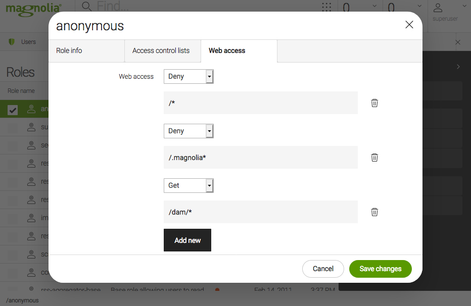
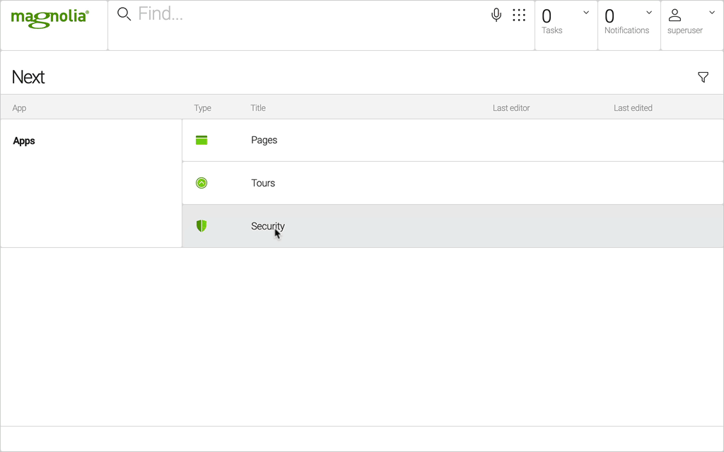
To see the tour images displayed in the SPA app on localhost:3000, you must add the web access GET right with path /.rest/* to the anonymous user in the Security app in your Magnolia Author instance.
|
Add some more styling
In /spa/react-minimal/src/components create a file TourList.css in the same directory as TourList.js and copy in this stylesheet:
.tour-list .tour-list-cards {
  display: flex;
  flex-wrap: wrap;
  justify-content: center;
}

.tour-list .tour-list-cards .card {
  max-width: 150px;
  margin-right: 15px;
  margin-bottom: 15px;
  -webkit-box-shadow: 10px 10px 28px -4px rgba(0, 0, 0, 0.53);
  -moz-box-shadow: 10px 10px 28px -4px rgba(0, 0, 0, 0.53);
  box-shadow: 10px 10px 28px -4px rgba(0, 0, 0, 0.53);
  transition: transform 0.4s ease-in-out;
  cursor: pointer;
}

.tour-list .tour-list-cards .card .card-img-top {
  width: 150px;
}

.tour-list .tour-list-cards .card .card-body {
  padding: 5px;
}

.tour-list .tour-list-cards .card .card-body .card-text {
  margin: 5px;
  opacity: 0.8;
  font-size: 10px;
  font-weight: 200;
  transition: opacity 0.8s ease-in;
}

.tour-list .tour-list-cards .card .card-body .card-title {
  margin: 0;
  font-weight: 200;
}

.tour-list .tour-list-cards .card:hover {
  transform: scale3d(1.5, 1.5, 1.5);
  transform-origin: center;
  background-color: #ffffff;
}

.tour-list .tour-list-cards .card:hover .card-body .card-text {
  opacity: 1;
}

.tour-list .tour-list-cards .card:hover .card-body .card-title {
  color: #00b39b;
}
Open your TourList.js file, and replace the code with this:
import React, { useState, useEffect } from "react";
import "./TourList.css";

const API_ENDPOINT =
  "http://localhost:8080/magnoliaAuthor/.rest/delivery/tours";
const IMAGE_BASE = "http://localhost:8080";

export default ({ headline }) => {
  const [tours, setTours] = useState([]);

  useEffect(() => {
    async function fetchTourList() {
      let response = await fetch(API_ENDPOINT);
      let data = await response.json();
      setTours(data.results);
    }
    fetchTourList();
  }, []);

  return (
    <div className="tour-list">
      <h1>{headline}</h1>
      {tours.length > 0 ? (
        <div className="tour-list-cards">
          {tours.map(tour => (
            <div class="card">
              <img
                src={IMAGE_BASE + tour.image.renditions["480x360"].link}
                class="card-img-top"
                alt="..."
              />
              <div class="card-body">
                <h5 class="card-title">{tour.name}</h5>
                <p class="card-text">{tour.description}</p>
              </div>
            </div>
          ))}
        </div>
      ) : (
        <h2>No Tours found</h2>
      )}
    </div>
  );
};
Add some more styling
Open the tour-list.component.css file in your previously created component directory /spa/angular-minimal/src/app/components/tour-list and copy in the following stylesheet:
It might be tour-list.component.scss depending on the configuration of your Angular CLI.
|
.tour-list .tour-list-cards {
  display: flex;
  flex-wrap: wrap;
  justify-content: center;
}

.tour-list .tour-list-cards .card {
  max-width: 150px;
  margin-right: 15px;
  margin-bottom: 15px;
  -webkit-box-shadow: 10px 10px 28px -4px rgba(0, 0, 0, 0.53);
  -moz-box-shadow: 10px 10px 28px -4px rgba(0, 0, 0, 0.53);
  box-shadow: 10px 10px 28px -4px rgba(0, 0, 0, 0.53);
  transition: transform 0.4s ease-in-out;
  cursor: pointer;
}

.tour-list .tour-list-cards .card .card-img-top {
  width: 150px;
}

.tour-list .tour-list-cards .card .card-body {
  padding: 5px;
}

.tour-list .tour-list-cards .card .card-body .card-text {
  margin: 5px;
  opacity: 0.8;
  font-size: 10px;
  font-weight: 200;
  transition: opacity 0.8s ease-in;
}

.tour-list .tour-list-cards .card .card-body .card-title {
  margin: 0;
  font-weight: 200;
}

.tour-list .tour-list-cards .card:hover {
  transform: scale3d(1.5, 1.5, 1.5);
  transform-origin: center;
  background-color: #ffffff;
}

.tour-list .tour-list-cards .card:hover .card-body .card-text {
  opacity: 1;
}

.tour-list .tour-list-cards .card:hover .card-body .card-title {
  color: #00b39b;
}
Open your tour-list.component.ts file and replace it with this code:
import { Component, Input } from '@angular/core';
import { HttpClient } from '@angular/common/http';

const API_ENDPOINT =
  "http://localhost:8080/magnoliaAuthor/.rest/delivery/tours";
const IMAGE_BASE = "http://localhost:8080";


@Component({
  templateUrl: './tour-list.component.html',
  styleUrls: ['./tour-list.component.scss'] (1)
})
export class TourListComponent {
  @Input() headline: any;
  @Input() tours: any;

  constructor(private http: HttpClient) {
    this.http = http;
  }

  ngOnInit() {
    this.http.get(API_ENDPOINT).subscribe((data: any) => {
      this.tours = data.results.map(item => ({ ...item, image: IMAGE_BASE + item.image.renditions[role=zoom,"480x360"].link }));
    })

  }
}| 1 | You might have to change the styleUrls to tour-list.component.scss depending on the name of your actual file. |
Edit the TourList component template tour-list.component.html and replace it with this content:
<div class="tour-list">
    <h1>{{ headline }}</h1>
    <div class="tour-list-cards">

        <div class="card" *ngFor="let tour of tours">
        <img
        [src]="tour.image"
            class="card-img-top"
            alt="..."
        />
        <div class="card-body">
            <h5 class="card-title">{{tour.name}}</h5>
            <p class="card-text">{{tour.description}}</p>
        </div>
        </div>

      </div>
</div>
Add some more styling
In /spa/vue-minimal/src/components open your TourList.vue file and add at the end of it the stylesheet:
<style scoped>
.tour-list .tour-list-cards {
  display: flex;
  flex-wrap: wrap;
  justify-content: center;
}

.tour-list .tour-list-cards .card {
  max-width: 150px;
  margin-right: 15px;
  margin-bottom: 15px;
  -webkit-box-shadow: 10px 10px 28px -4px rgba(0, 0, 0, 0.53);
  -moz-box-shadow: 10px 10px 28px -4px rgba(0, 0, 0, 0.53);
  box-shadow: 10px 10px 28px -4px rgba(0, 0, 0, 0.53);
  transition: transform 0.4s ease-in-out;
  cursor: pointer;
}

.tour-list .tour-list-cards .card .card-img-top {
  width: 150px;
}

.tour-list .tour-list-cards .card .card-body {
  padding: 5px;
}

.tour-list .tour-list-cards .card .card-body .card-text {
  margin: 5px;
  opacity: 0.8;
  font-size: 10px;
  font-weight: 200;
  transition: opacity 0.8s ease-in;
}

.tour-list .tour-list-cards .card .card-body .card-title {
  margin: 0;
  font-weight: 200;
}

.tour-list .tour-list-cards .card:hover {
  transform: scale3d(1.5, 1.5, 1.5);
  transform-origin: center;
  background-color: #ffffff;
}

.tour-list .tour-list-cards .card:hover .card-body .card-text {
  opacity: 1;
}

.tour-list .tour-list-cards .card:hover .card-body .card-title {
  color: #00b39b;
}
</style>
Next replace script with this:
<script>
const API_ENDPOINT =
  "http://localhost:8080/magnoliaAuthor/.rest/delivery/tours";

export default {
  name: "TourList",
  props: ["headline"],
  data() {
    return {
      tours: [],
      imageBase: "http://localhost:8080"
    };
  },
  created() {
    this.fetchTours();
  },
  methods: {
    async fetchTours() {
      let response = await fetch(API_ENDPOINT);
      let data = await response.json();
      this.tours = data.results;
    }
  }
};
</script>
And extend the template to display the tours by replacing template with following code:
<template>
<div class="tour-list">
<h1>{{headline}}</h1>
<div v-if="tours.length > 0" class="tour-list-cards">
<div class="card" v-for="tour in tours" v-bind:key="tour.path">
<img
v-bind:src="imageBase + tour.image.renditions['480x360'].link"
class="card-img-top"
alt="..."
/>
<div class="card-body">
<h5 class="card-title">{{tour.name}}</h5>
<p class="card-text">{{tour.description}}</p>
</div>
</div>
</div>
<h2 v-else>No Tours found</h2>
</div>
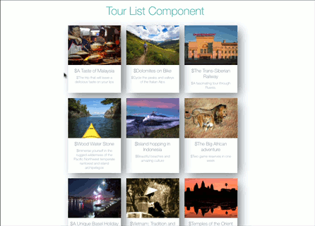
</template>You have upgraded your SPA component. Now open up the Page Editor again and view your page.
You will see the new tour list.